> For the complete documentation index, see [llms.txt](https://docs.kaliumtheme.com/llms.txt). Markdown versions of documentation pages are available by appending `.md` to page URLs; this page is available as [Markdown](https://docs.kaliumtheme.com/post-types/portfolio/creating-a-portfolio-item/zig-zag.md).
# Zig Zag
Content and gallery alternating down the page.
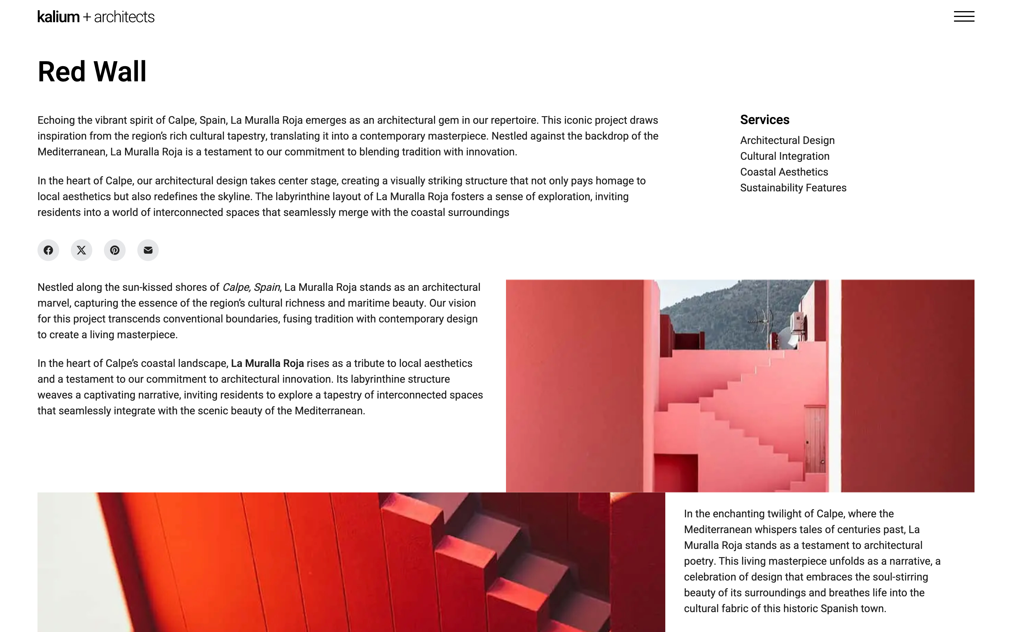
The Zig Zag item type presents a distinctive layout where content and gallery items alternate in a zigzag pattern, creating a dynamic visual flow. This layout is ideal for showcasing items in a staggered fashion, enhancing visual interest and engagement.
This item type offers similar options to the [Side Portfolio](/post-types/portfolio/creating-a-portfolio-item/side-portfolio.md) layout, with additional gallery item settings such as description content, width, and alignment.
## Zig Zag Options
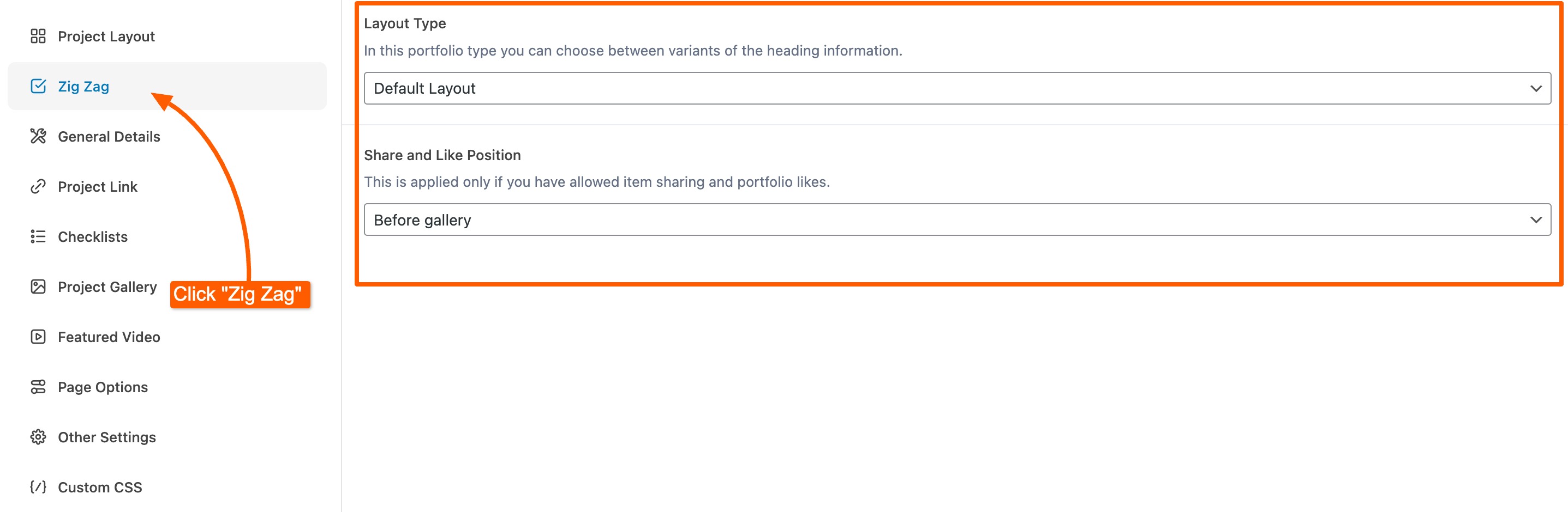
After selecting the **Zig Zag** item type, a new section will appear in **Parameters and Options** called **Zig Zag**, offering custom **Project Gallery** options and layout configurations for this particular item type.
### Content Alignment
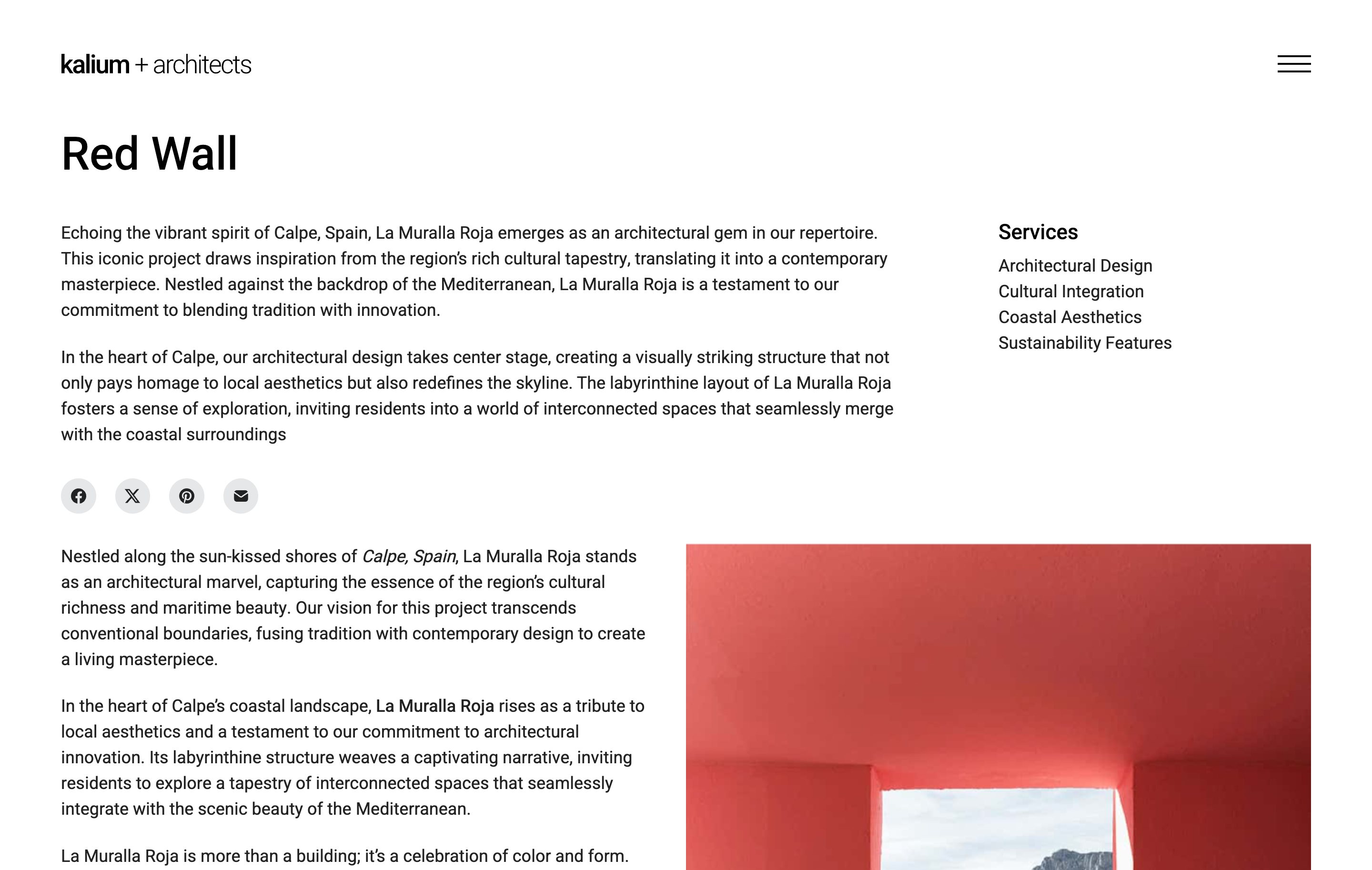
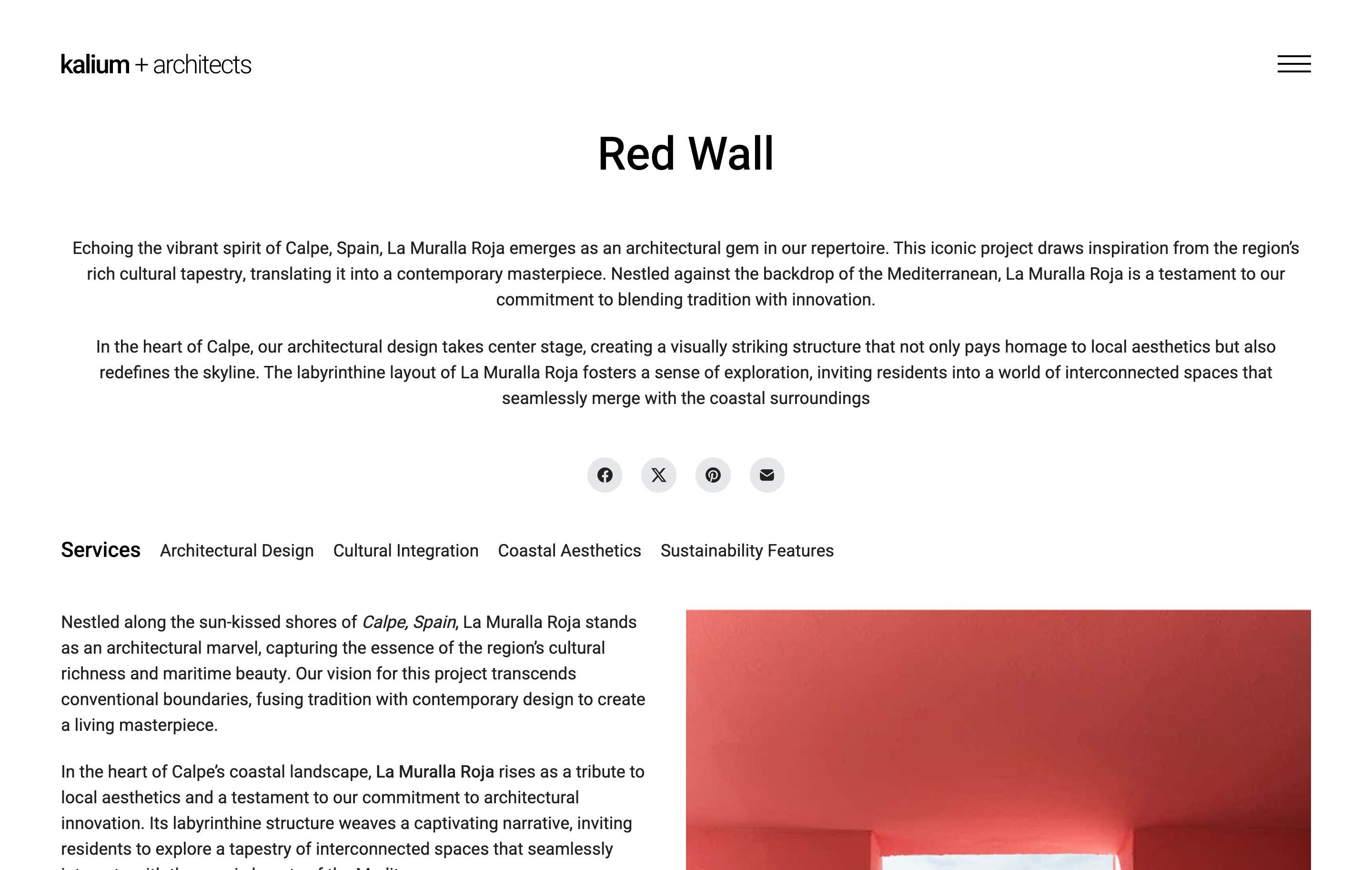
You can choose between two layout types: **Default Layout** and **Centered Content Layout**. These options allow you to align the content either to the left or center it within the page.
Left alignment (Right in RTL)
Centered content alignment
## Project Gallery
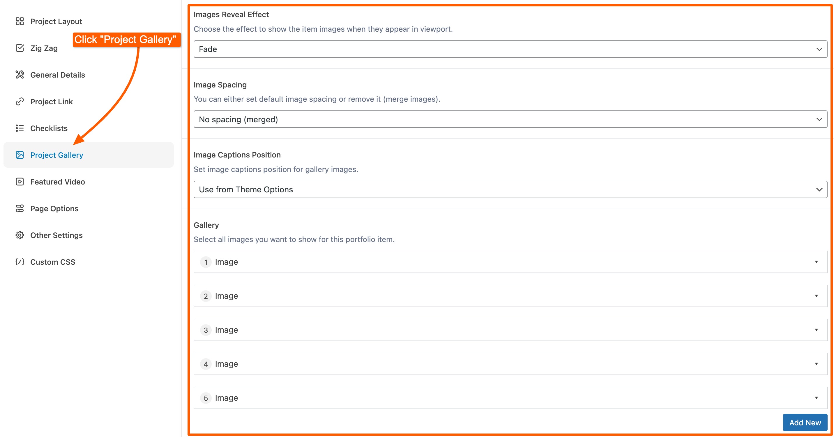
You can customize your Project Gallery with several options, including:
* **Images Reveal Effect:** *None*, *Fade* or *Slide and Fade* as gallery items come into view.
* **Image Spacing:** *Default spacing* or *No spacing (merged)*.
* **Image Captions Position:** *Use from Theme Options*, *On hover* or *Below image*.
The Project Gallery section supports various media types:
* **Image:** Display a single image to showcase individual visuals or key elements of your project.
* **Images Slider:** Add a slider with multiple images for viewers to scroll through different angles or stages of your project.
* **Comparison Images:** Use an interactive slider to compare two images side by side, ideal for before-and-after shots or contrasting design options.
* **YouTube Video**, **Vimeo Video** and **Self-Hosted Video:** Embed a video for project demonstrations or other relevant content.
* **HTML:** Add custom HTML to include additional elements such as interactive widgets, forms, or bespoke features that enhance your gallery.
This layout has no **Text Quote** item, unlike Side Portfolio and Columned.
Zig Zag provides additional details for every gallery item type, including:
* **Description:** Rich text editor for adding detailed descriptions.
* **Description Width:** *Six columns (50%)*, *Five columns (40%)* or *Four columns (33%)*.
* **Description Alignment:** *Left* or *Right* of the gallery media.
To add a gallery item, click **Add New** and select from the available media types.
Each gallery item type has its own set of options with inline explanations for their functionality and usage.