> For the complete documentation index, see [llms.txt](https://docs.kaliumtheme.com/llms.txt). Markdown versions of documentation pages are available by appending `.md` to page URLs; this page is available as [Markdown](https://docs.kaliumtheme.com/general/header/other-options.md).
# Other Options
The remaining header settings that do not fit elsewhere.
In addition to the previous configuration options for the header, the following extra settings offer additional customization and functionality that complement the main features:
### Full Width Container
This option allows the header to stretch across the entire width of the viewport, providing a seamless and uninterrupted appearance from edge to edge of the screen.
### Submenu Arrow
This option controls the visibility of the arrow indicator next to menu items that have submenus. The arrow helps users identify expandable menu items and indicates that additional options are available when clicked or hovered over.
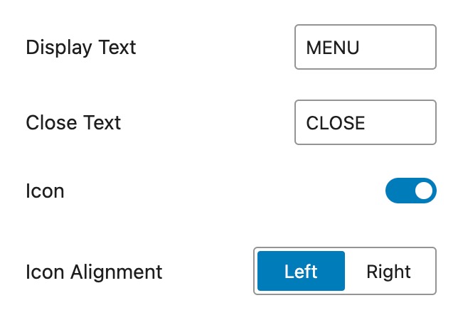
### Hamburger Icon Label
This option allows you to set a label or text that appears next to the hamburger menu icon. It provides additional context or instructions for users, making it clear that the icon will open the mobile navigation menu.
**Display Text**\
Text displayed next to the hamburger menu icon, indicating that clicking it will open the menu.
**Close Text**\
Text displayed next to the hamburger menu icon when the menu is open, indicating that clicking it will close the menu.
**Icon**\
Toggle to show or hide the hamburger menu icon.
**Icon Alignment**\
Sets the position of the hamburger menu icon within the header, allowing alignment options such as left or right.
***
### Search
Adds a search icon to the header. This option, and the two below it, appear only while **Main Menu Type** is one of the pre-defined types; with a **Custom** header you add the Search Field element yourself instead.
Switching it on gives you two settings of its own:
**Animate Search Icon**\
Animates the icon when the search input takes focus. On by default.
**Animation Type**\
**Shift** or **Scale**, with Scale the default. Only while Animate Search Icon is on.
***
### Cart
Adds a cart to the header. Needs WooCommerce.
**Icon**\
Three cart icons to pick from, a shopping bag, a cart and a basket, or **None** for no icon at all.
**Title**\
Optional text shown next to the icon.
**Hide when Empty**\
Hides the cart entirely while there is nothing in it.
**Counter Badge**\
Shows the number of items on the icon. On by default.
**Click Action**\
**Go to Cart Page** or **Show Mini Cart**. Show Mini Cart is the default.
**Show On**\
Whether the mini cart opens on **Click** or **Hover**. Click is the default, and the setting appears only when Click Action is Show Mini Cart.
***
### Language Switcher
Adds a language switcher to the header. Needs WPML.
**Show Flag**\
Whether the language flag appears at all. On by default.
**Flag Position**\
**Left** or **Right** of the language name, Left by default. Only while Show Flag is on.
**Show Label**\
Whether the language name appears. On by default.
**Label Format**\
How the name reads: **Native name**, **Translated name**, **Initials**, **Native name (Translated name)** or **Translated name (Native name)**. Native name is the default, and the setting appears only while Show Label is on.