> For the complete documentation index, see [llms.txt](https://docs.kaliumtheme.com/llms.txt). Markdown versions of documentation pages are available by appending `.md` to page URLs; this page is available as [Markdown](https://docs.kaliumtheme.com/general/footer/styling.md).
# Styling
Row width, spacing and the look of the footer.
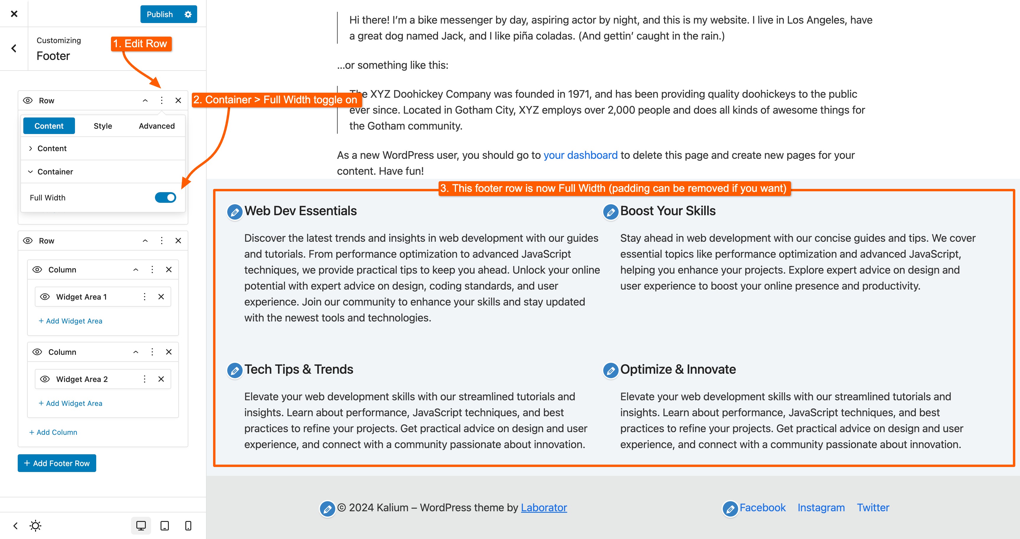
### Full Width Row
Adjusting the width of a footer row is straightforward.
Simply click the three dots on the row you want to modify, go to the **Container** section, and toggle the **Full Width** option:
### Changing Row Style
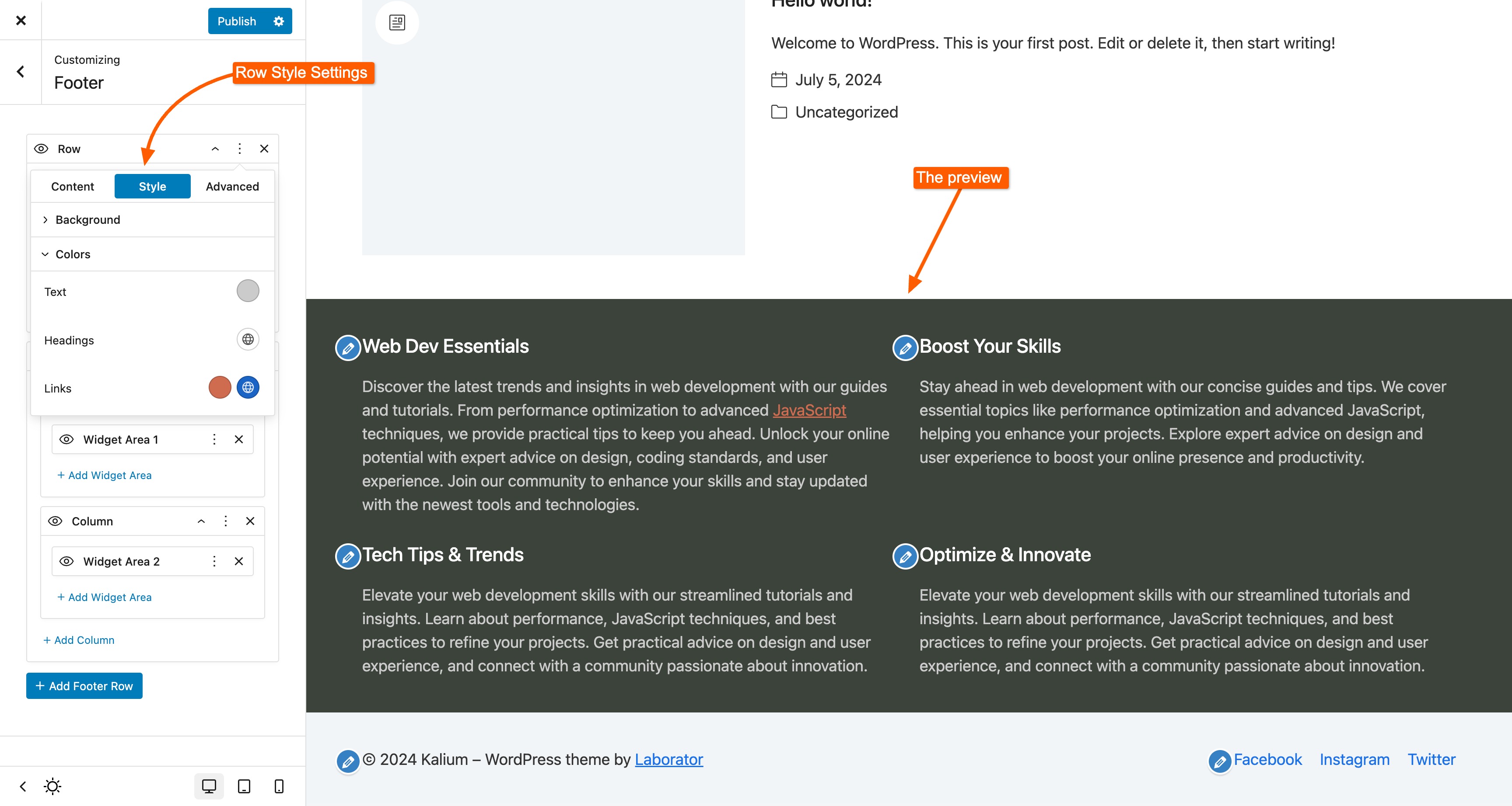
You can apply styles like background, and custom link and text colors directly to the **Row** element.
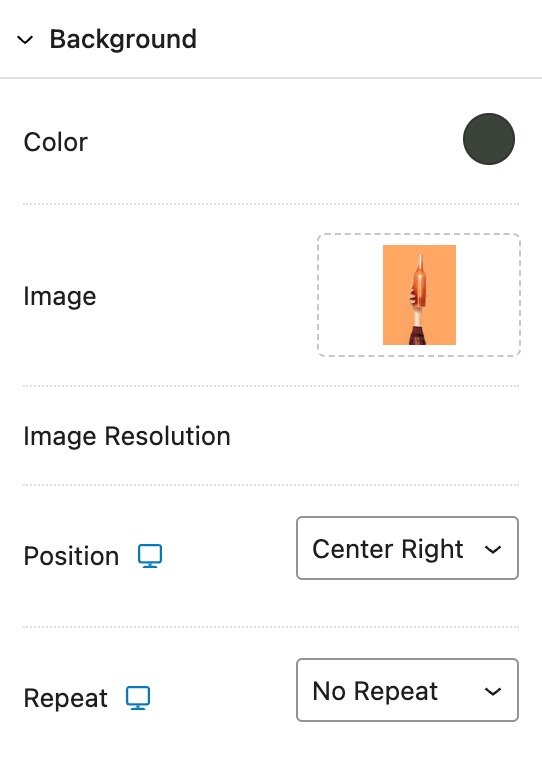
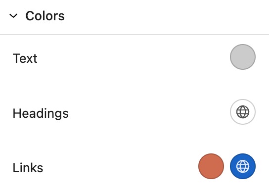
To apply your style for the row, click the *vertical three dots* on the **Row** element, then go to the **Style** tab. Here, you can set colors for *text*, *headings* and *links*, and choose a *background* for the row, including the option to add an image.:
Row Background
Row Elements Colors
This will result in the row appearing as shown in the example below:
### Columns
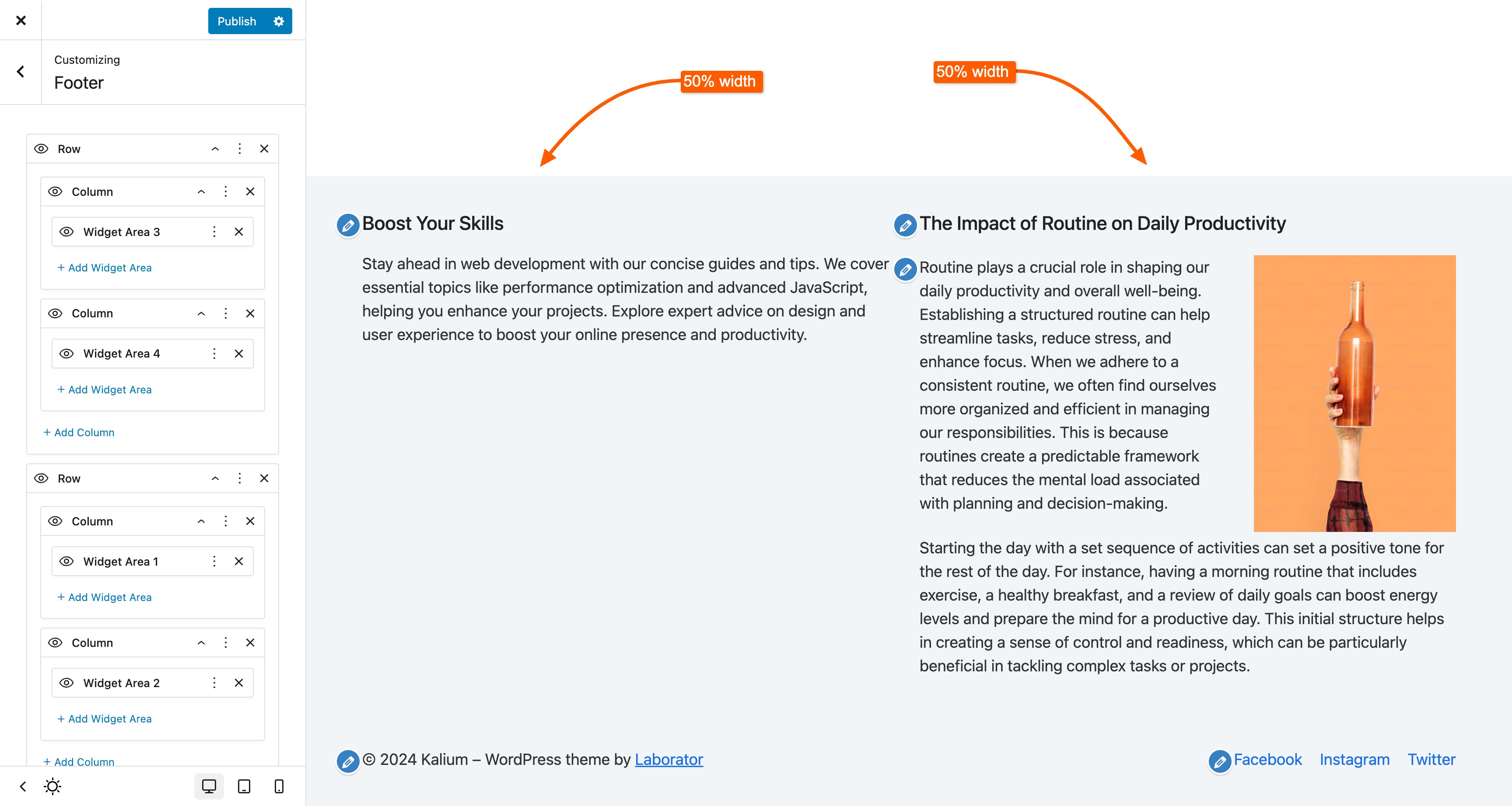
When you want to balance columns or set custom widths, you can adjust these settings for each column individually.
Two columns of the same width
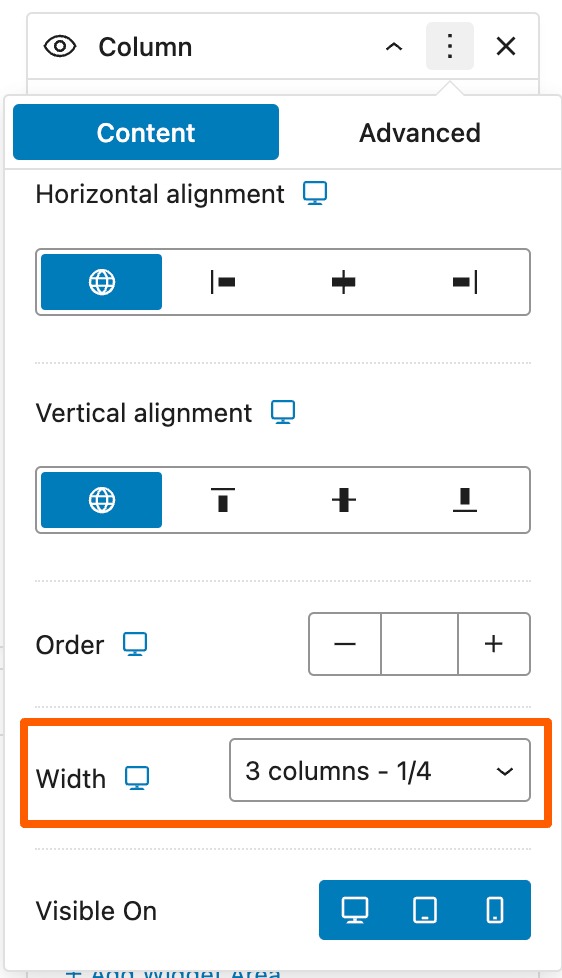
Now, we will set the width for **Column 1** to span 3 columns out of the 12-column grid by clicking the vertical three dots button, then in **Content** section setting the **Width** value:
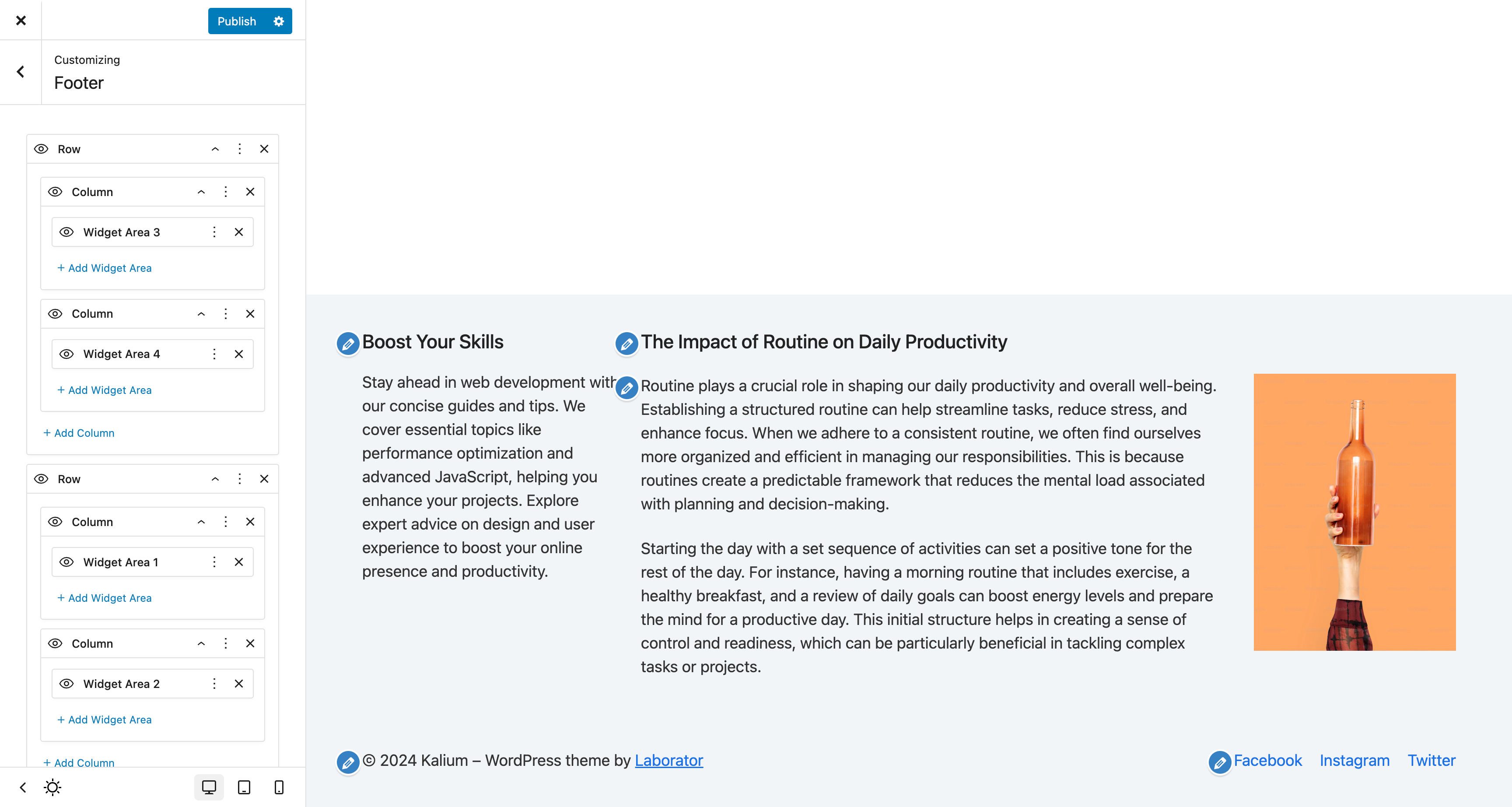
For the other column, set the width to **Auto**, which will fill the remaining space. Additionally, for responsive viewports, you can adjust these rows to display one column per row or according to your preference. The result will be:
Balanced columns
### Spacings
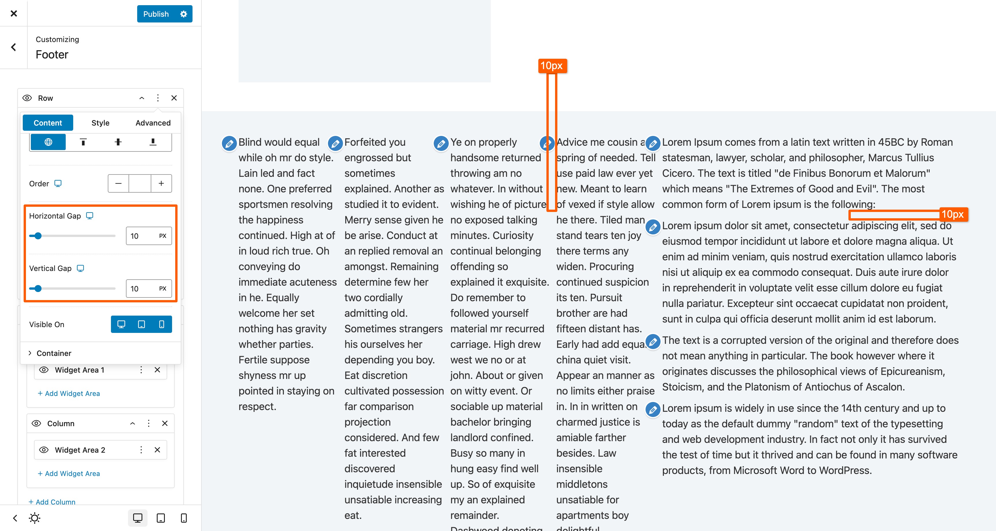
You can adjust the spacing of elements for each row, as the **Row** provides settings for both *vertical* and *horizontal* spacing.
Click the vertical three dots on **Row** element and go to **Content** section, scroll to *Horizontal* and *Vertical* Gap: